A Vibrant Guide to Design Harmony
When it comes to design, there’s one universal truth: colors aren’t just colors—they’re emotions in disguise. Over 60% of people accept or reject a brand based on its colors alone. That’s why when you think of Coca-Cola, you feel “red,” McDonald’s screams “yellow,” and Starbucks whispers “green serenity” in your ear.
Picking the right colors isn’t just about aesthetics; it’s about creating a memorable brand personality. And one of the most powerful tools in a designer’s toolbox is a fascinating concept: triadic color schemes. So today, let’s dive deep into answering the question: what are triadic colors, and why are they such a game-changer?
What Are Triadic Colors?
If you’ve ever tried to mix and match colors and ended up with a result that looked like a toddler’s art project gone rogue—don’t worry, you’re not alone.
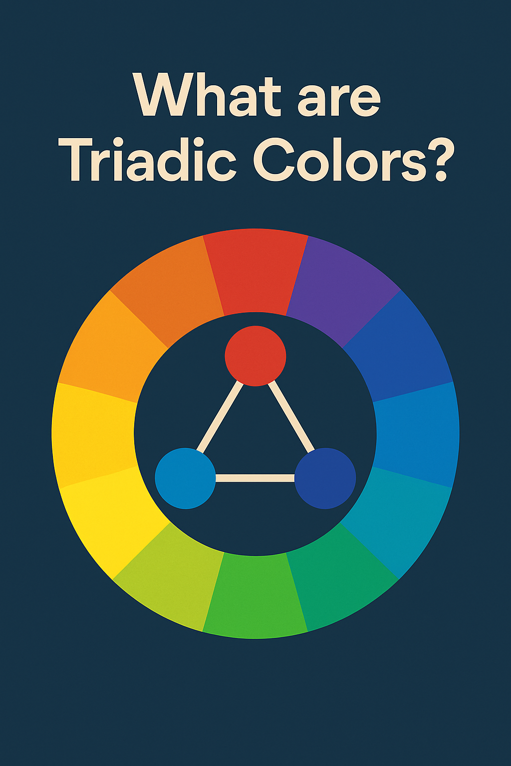
What are triadic colors, you ask? They’re three colors that are evenly spaced around the color wheel, forming a perfect triangle. Famous examples include:
- Red, Yellow, Blue (Primary)
- Orange, Green, Purple (Secondary)
Unlike complementary colors (which sometimes clash like two egos in a reality show), triadic colors maintain balance while offering strong contrast. It’s the best of both worlds: vibrant yet harmonious. No drama, just pure magic.
How Triadic Color Schemes Work
Here’s the basic recipe:
- Pick one dominant color: Your brand’s “main character.”
- Use two accents: Supporting actors that enhance the story without stealing the spotlight.
Understanding the color wheel is crucial here. The emotional impact of your dominant color leads the show:
- Red-dominant schemes scream energy and passion.
- Yellow-dominant schemes beam warmth and optimism.
- Blue-dominant schemes whisper calmness and trust.
A good triadic scheme can make your audience feel something before they even realize it. (And trust me, making people feel things in marketing is half the battle won.)
How to Select the Perfect Triadic Color Scheme
Now that you’re wondering not just what are triadic colors but also how to use them, here’s a foolproof plan:
1. Set the Context
What mood do you want your design to convey—joy, trust, excitement, rebellion?
2. Choose the Lead Color
This color should match your brand’s essence. Fintech startups often go blue for trust; kids’ brands often go orange for energy.
3. Pick Accents
Find the two colors equally spaced on the wheel from your dominant color.
4. Check for Harmony
Use tools like Adobe Color or Coolors to see if your triad looks like a Picasso… or a crime scene.
5. Follow the 60-30-10 Rule
60% dominant color, 30% secondary color, 10% accent. It’s the golden ratio of design.
6. Test for Accessibility
Ensure enough contrast for readability—because even the most gorgeous palette is useless if half your audience can’t read your text.
Real-World Examples of Triadic Color Schemes
Sometimes the best way to answer “what are triadic colors” is to see them in action:
- Tide uses orange, yellow, and blue. Clean, fresh, and trustworthy—everything you want in laundry detergent.
- Airtable leans into red, yellow, and blue. Organized, vibrant, and creative.
- Nickelodeon’s website boasts orange, green, and blue—a kid’s paradise of energy and fun.
- Movies like Pierrot Le Fou and The Incredible Hulk also master triadic palettes to tell unforgettable stories.
How Different Industries Use Triadic Colors
- Photography: Capture dynamic compositions using triadic colors in clothing, backgrounds, and props.
- Film: Directors like Wes Anderson and Ang Lee use triadic palettes to build emotion and tone.
- Web Design: Brands like Nickelodeon use triadic color schemes to instantly capture attention.
- Interior Design: Homeowners create lively, balanced spaces by mixing one vibrant color with two more subdued accents.
No matter your field, triadic colors offer a way to make your visuals both powerful and pleasantly cohesive.
Common Triadic Color Combinations to Try
Want to impress your clients—or just your own Instagram followers? Try these combos:
- Red – Yellow – Blue
- Orange – Green – Purple
- Yellow-Orange – Blue-Green – Red-Violet
- Blue-Violet – Red-Orange – Yellow-Green
Start experimenting—you might just stumble onto the next visual trend before it even hits Pinterest.
Quick Tips for Mastering Triadic Colors
- Choose your dominant color wisely—it’s the “face” of your design.
- Lower the saturation of accents to prevent visual overload.
- If bold isn’t your brand vibe, pastel triadic combinations can be elegant and soothing.
- Always mockup first, commit later. (Because heartbreak over ugly palettes is real.)
Conclusion: The Takeaway
Understanding what are triadic colors is like getting a secret key to design success. These vibrant trios help you create harmony, evoke emotions, and build powerful brand impressions.
While not every project needs a full-blown triadic explosion, knowing how to apply it thoughtfully gives you a major creative edge. So grab a color wheel, unleash your inner Picasso, and make designs that not just look good—but feel right.
And if you’re looking for someone to help your branding, web design, or marketing visuals stand out using expert color psychology, that’s where we come in.
At SE Rank Pro, we are a leading digital marketing company in Chandigarh that understands not just how to market your brand but how to make it unforgettable. If you ever need help crafting powerful designs and vibrant branding strategies, our digital marketing company in Chandigarh is just a click away.
Ready to turn heads? Let’s get colorful!